How to use Nebula Software UI
The Nebula Software applications use an advanced User Interface (UI). It is novel, convenient, and fast. But, you may find it a bit strange at first, so this document and its videos are here to help you get going quickly.
Mouse Cursor Images
Here are the various mouse cursor images you may encounter.

Labels
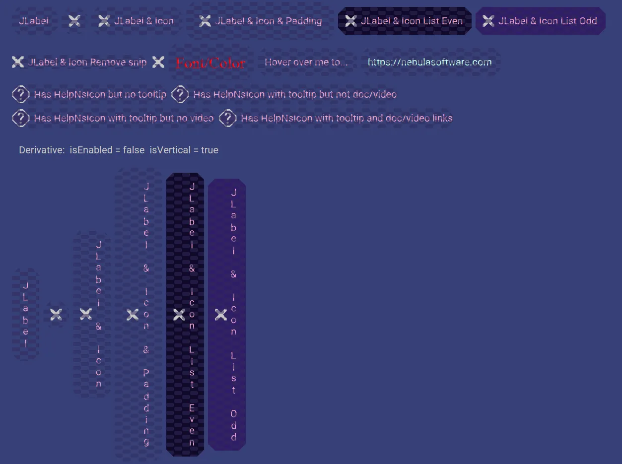
Here are examples of labels.
They can be just text, just an icon, or both.
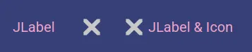
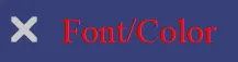
They may appear with different colors.

If their text is truncated, then you can hover over it to see the full text.
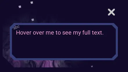
If their text is a hyperlink, then you can click on it to open it in a web browser.

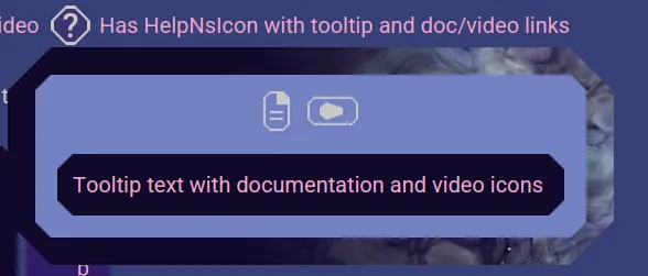
They may have a help icon next to them. If they do, you can click or hover on it to see the tooltip with option document and video links.

Labels may also be vertical.
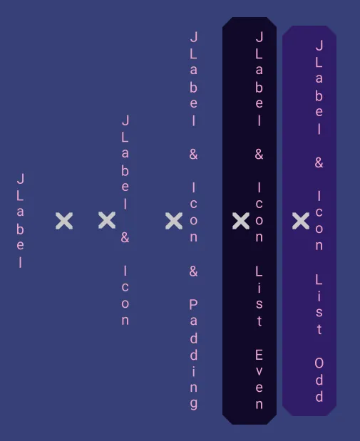
Here are what disabled labels look like.
Buttons
Here are examples of buttons.
They can be just text, just an icon, or both.
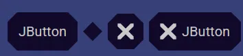
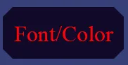
They may appear with different colors.
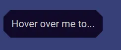
If their text is truncated, then you can hover over it to see the full text.
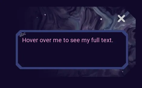
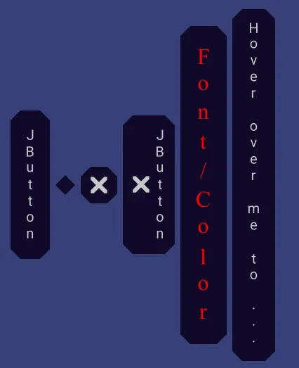
Buttons may also be vertical.
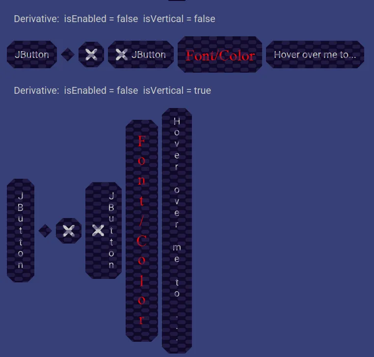
Here are what disabled buttons look like.
Toggle Buttons
Here are examples of toggle buttons.
They can be just text, just an icon, or both.

They may appear with different colors.
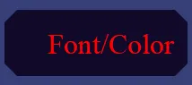
If their text is truncated, then you can hover over it to see the full text.
When you hover over a toggle button, it show a toggle icon as a hint so that you know this is a toggle button.
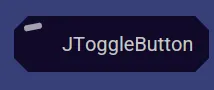
When you click the toggle button, that icon hint moves into place as the full size toggled indicator. This toggle button is now in the toggled state. You can think of this as a feature that can be on or off is now in the on state.
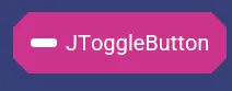
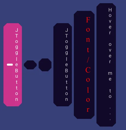
Toggle buttons may also be vertical.
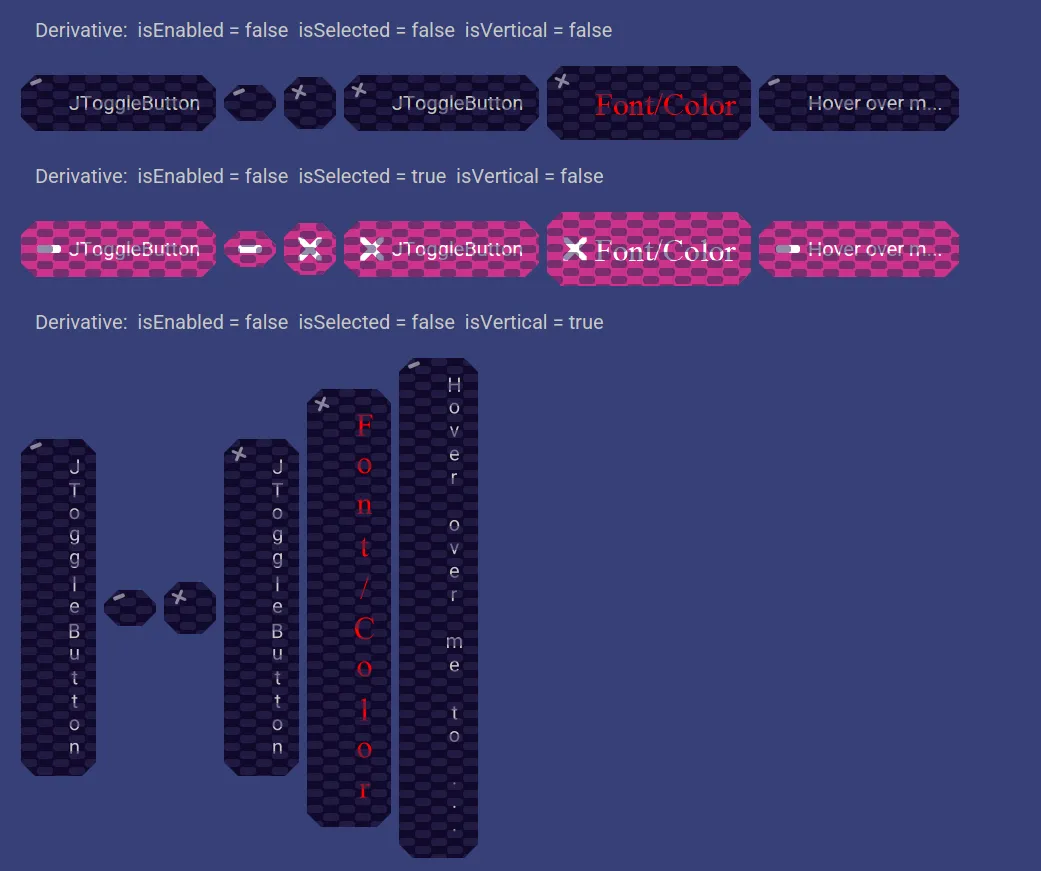
Here are what disabled toggle buttons look like.
Checkbox Buttons
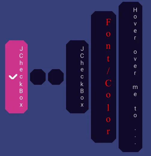
Here are examples of checkbox buttons.
They can be just text, just an icon, or both.

They may appear with different colors.
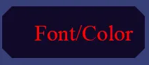
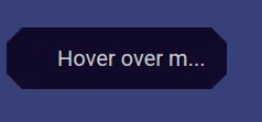
If their text is truncated, then you can hover over it to see the full text.
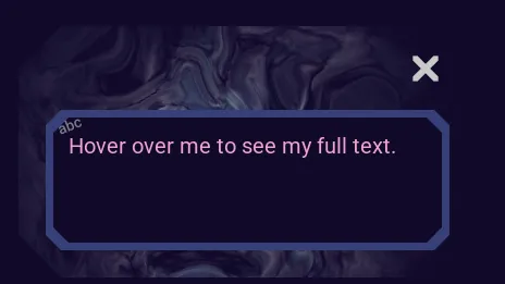
When you hover over a checkbox button, it show a check icon as a hint so that you know this is a checkbox button.
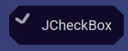
When you click the checkbox button, that icon hint moves into place as the full size checked indicator. This checkbox button is now in the checked state. You can think of this as a feature that can be on or off is now in the on state.

Checkbox buttons may also be vertical.
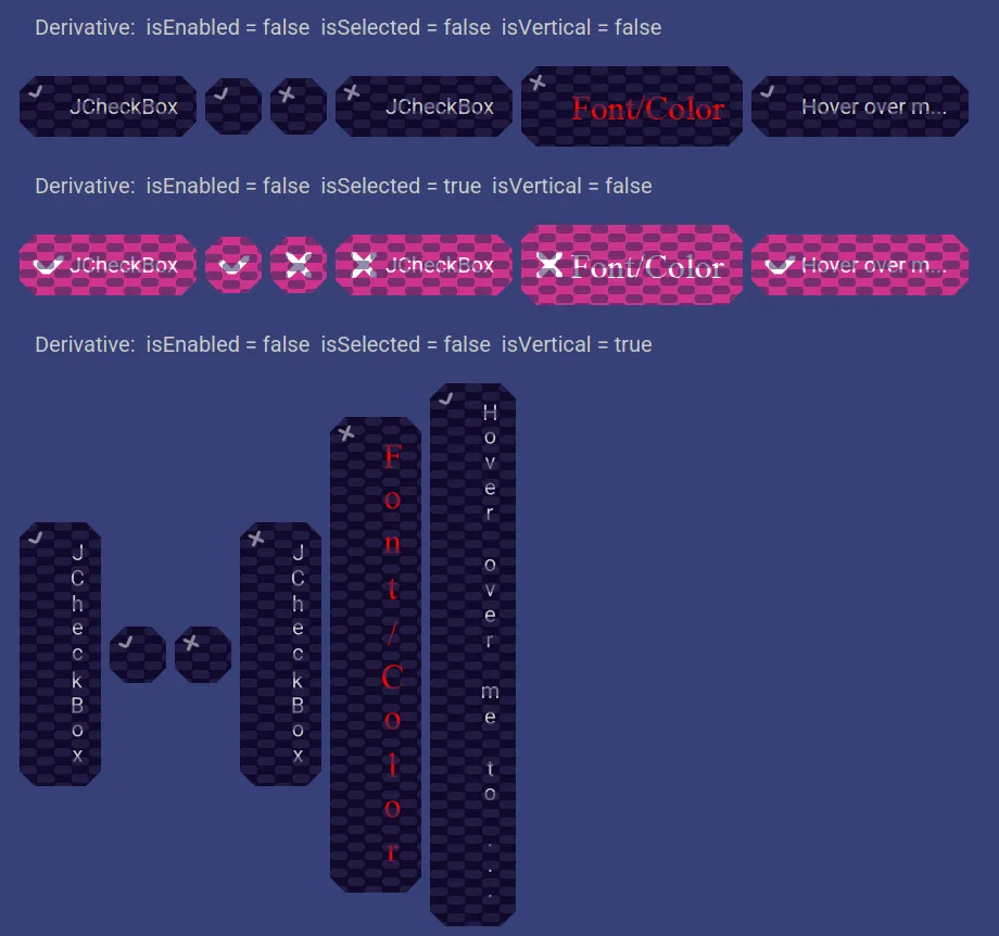
Here are what disabled checkbox buttons look like.
Radio Buttons
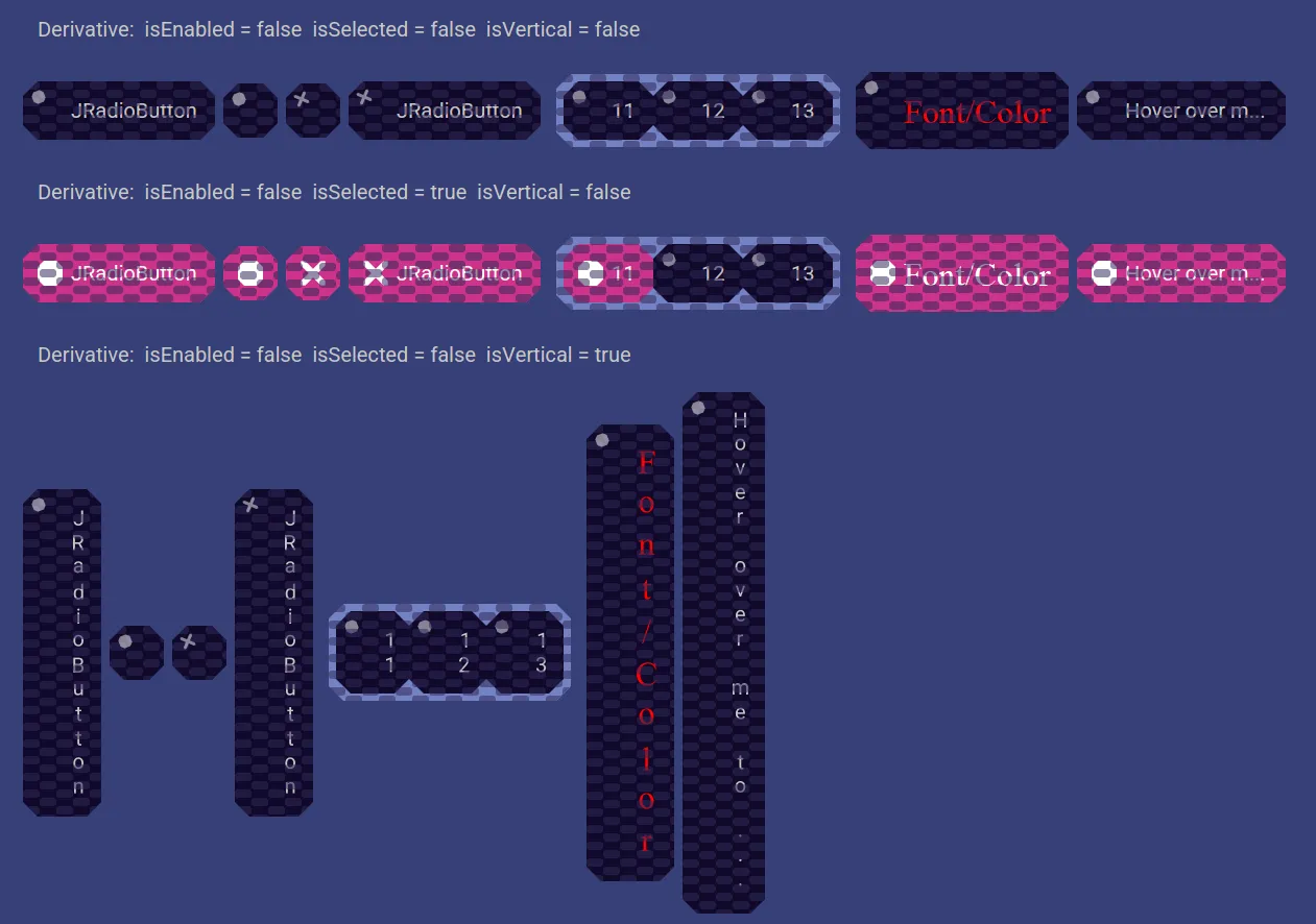
Here are examples of radio buttons. They can be just text, just an icon, or both.

They may appear with different colors.
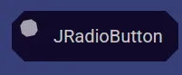
When you hover over a radio button, it show an icon as a hint so that you know this is a radio button.
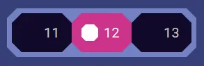
When you click the radio button, that icon hint moves into place as the full size selected indicator. This radio button is now in the selected one of the 3 choices. You can think of this as a feature that can be only one from a group of choices and this is now choice 12.
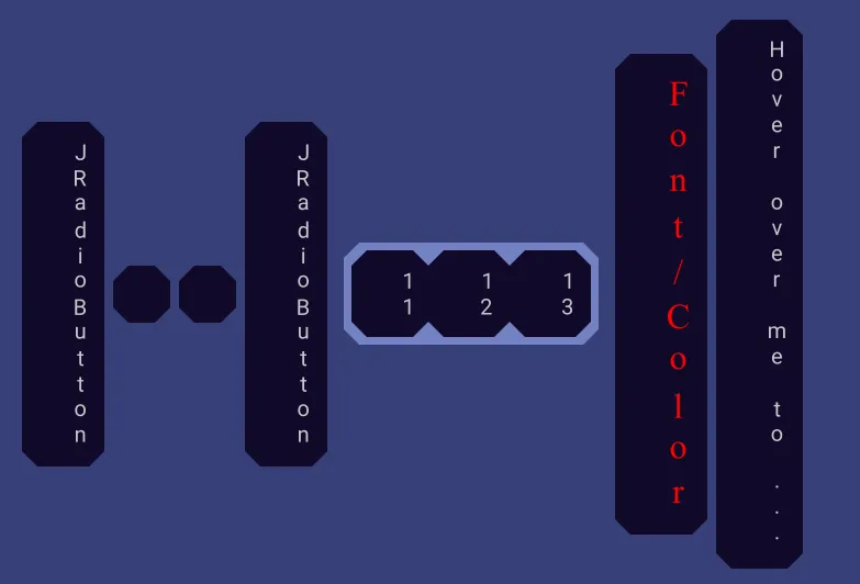
Radio buttons may also be vertical.
Here are what disabled radio buttons look like.
Icons
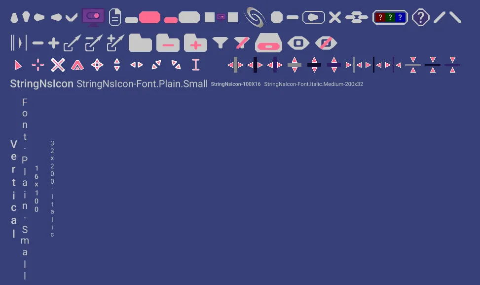
Here are examples of various icons you might see. Icons are small graphics or text used to represent functions, features, state, or other information.
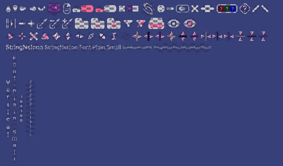
Here are what they look like disabled.
Scroll Pane
Here is an example of a Scroll Pane.
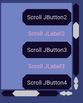
See more by dragging the knob, clicking in the track, holding the mouse down in the track, clicking on the up and down arrows, or scrolling with your mouse wheel.
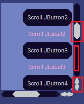
If you want to use your mouse wheel to scroll horizontally, then hold down the SHIFT key while doing so.
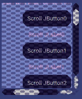
Here is a disabled scrollpane.
Text Fields
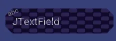
Here is an example of a text field.
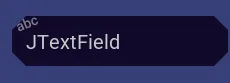
Text fields allow you to type in some text.
When you hover over one, it shows an a-b-c icon to let you know this is a text field.
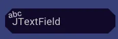
Click inside it to start editing your text.
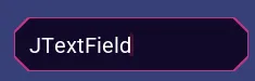
You can use the arrow keys to move around. You can use delete and backspace keys.
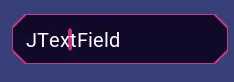
You can double click to select all text, or drag to select part of the text.
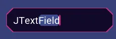
You can use CTRL key plus z to undo and SHIFT CTRL plus z to redo.
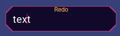
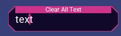
Hover over the top to show a button that will clear all text.
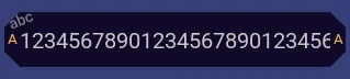
If the text is too large to be seen all at once, then little buttons on the left and right allow you to show all text. The little a stands for all.
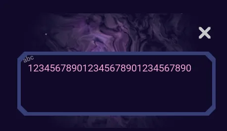
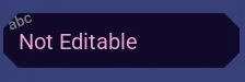
Some text fields do not let you type into them.
Password Text Fields
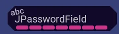
Here is an example of a password text field.
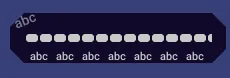
Password text fields allow you to type in a password without the text being visible. But, if you need to see what you are typing, then you can click the button at the bottom to show the text of the password.
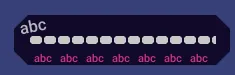
When you hover over one, it shows an a b c icon to let you know this is a text field.
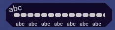
Click inside it to start editing your password.
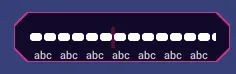
You can use the arrow keys to move around. You can use delete and backspace keys.
You can double click to select all text, or drag to select part of the text.
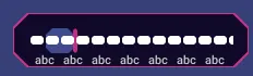
You can use CTRL key plus z to undo and SHIFT CTRL plus z to redo.
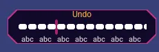
Hover over the top to show a button that will clear all text.
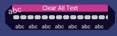
You can exit edit mode by clicking outside the password text field. You may also exit edit mode by pressing the escape key.
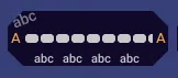
If the text is too large to be seen all at once, then little buttons on the left and right allow you to show all text. The little a stands for all.
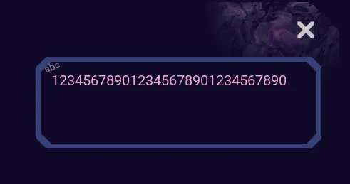
Some password text fields don't let you edit the text.
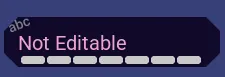
Here are examples of disabled password text fields.

Formatted Text Fields
Here is an example of a formatted text field.
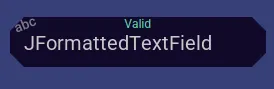
Formatted text fields allow you to type in a text but restrict what can be entered. For example, only allow numbers from 0 to 10.
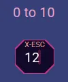
When you hover over one, it shows an a b c icon to let you know this is a text field.

Click inside it to start editing your formatted text.
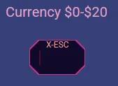
You can use the arrow keys to move around. You can use delete and backspace keys.
You can double click to select all text, or drag to select part of the text.
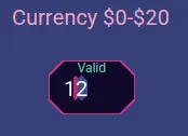
You can use CTRL key plus z to undo and SHIFT CTRL plus z to redo.
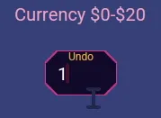
Hover over the top to show a button that will clear all text.
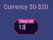
You can exit edit mode by clicking outside the formatted text field. You may also exit edit mode by pressing the escape key.
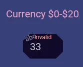
If the text is too large to be seen all at once, then little buttons on the left and right allow you to show all text. The little a stands for all.
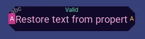
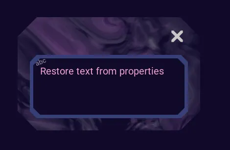
Formatted text fields keep the focus until you enter the correctly formatted text. Or you may use the escape key to exit text entry mode.
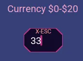
If you leave text that is not of the correct format, then at the top it tells you the text is invalid.
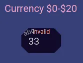
Some formatted text fields don't let you edit the text.
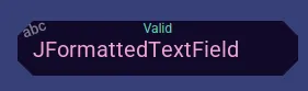
Here are examples of disabled formatted text fields.

Text Areas
Here is an example of a text area.
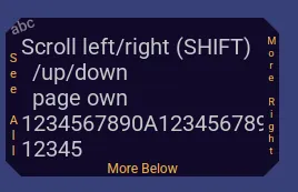
Text areas allow you to enter large amounts of text and can scroll vertically and horizontally.
When you hover over one, it shows an a b c icon to let you know this is a text field.
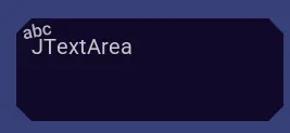
Click inside it to start editing your text.
You can use the arrow keys to move around. You can use delete and backspace keys.
You can double click to select text, or drag to select part of the text.
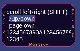
You can use CTRL key plus z to undo and SHIFT CTRL plus z to redo.
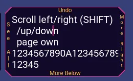
Hover over the top to show a button that will clear all text.
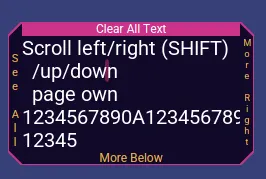
You can exit edit mode by clicking outside the text area. You may also exit edit mode by pressing the escape key.
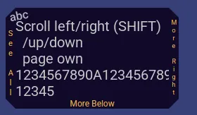
If the text is too large to be seen all at once, then little buttons tell you there is more text and when you click them it shows you all the text.
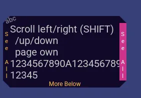
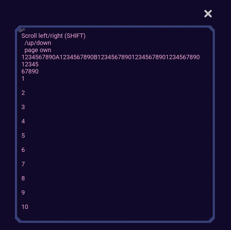
Some text areas don't let you edit the text.
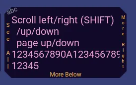
Here are examples of disabled text areas.

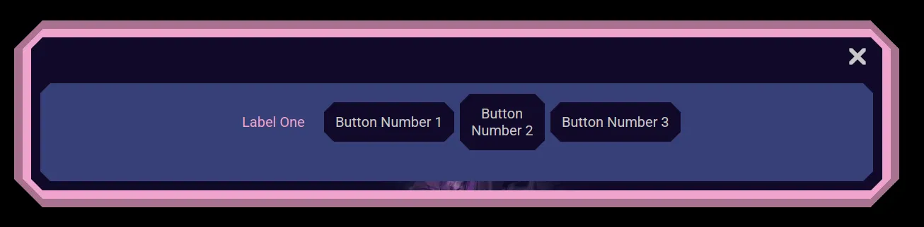
Dialogs
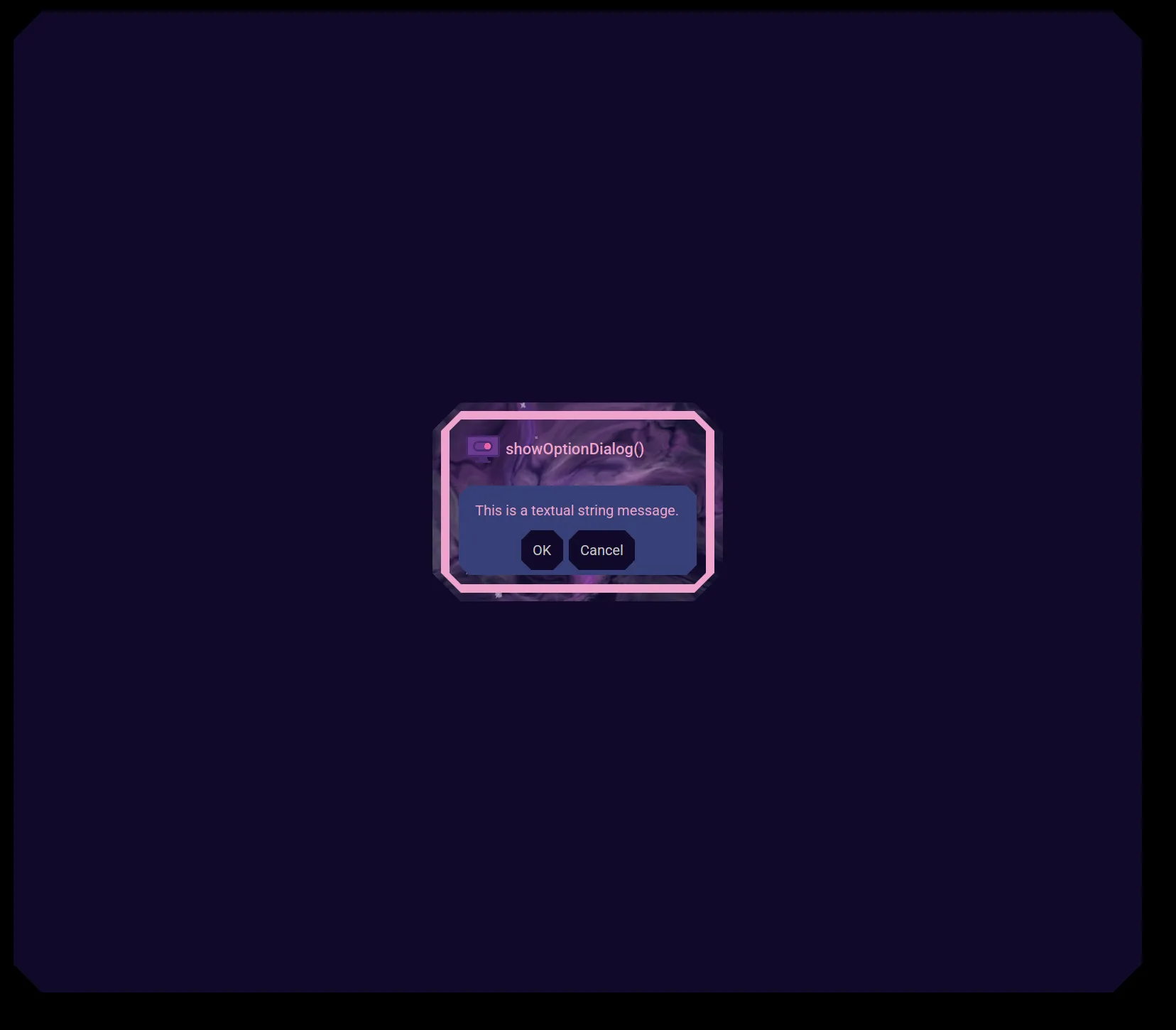
Here is an example of a Dialogs. Dialogs popup, hide what is behind them, and prevent dismissing them or activating other windows until they have been satisfied.
Stack Panes
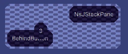
Here is an example of a Stack Pane.
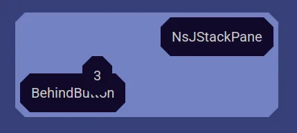
Stack Panes allow user interface components to be stacked on top of each other, yet still function normally.
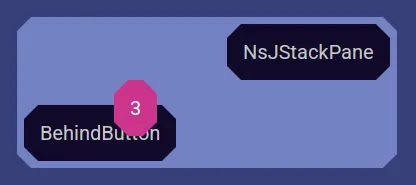
Here is a disabled Stack Pane.
Focus Cycle
Here is an example of user interface components that automatically get the focus.
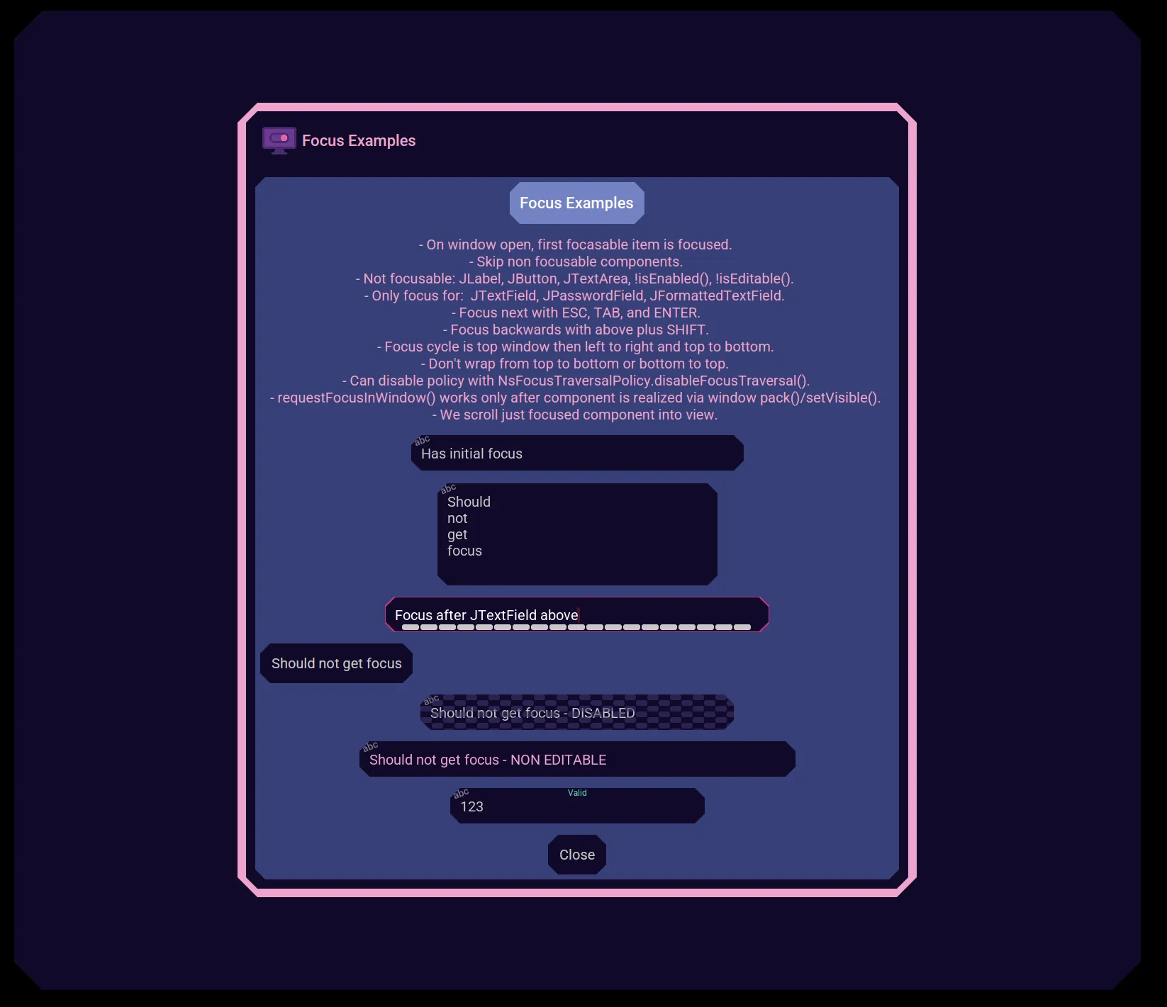
Use the tab key to jump to the next focusable component.
Only some components are focusable.
Hold down the shift key when you press tab to jump backwards.
The focus cycles left to right and top to bottom.
The focus cycle intentionally does not wrap around.
Layered Panels
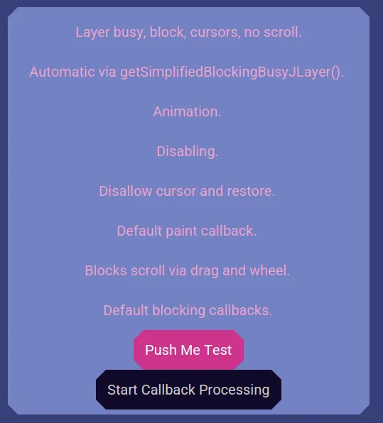
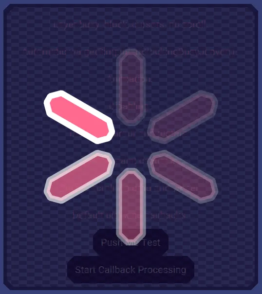
Some components may get a layer over the top of them. For example, this one blocks the "Push Me Test" button while displaying a busy animation.
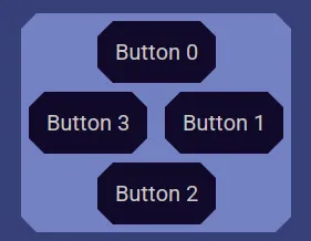
Diamond Layout
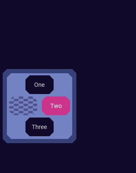
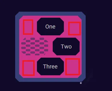
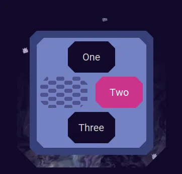
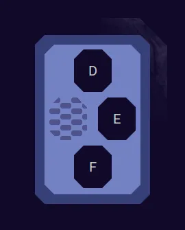
Some components are laid out in a circular diamond pattern. Here you see 4 buttons.
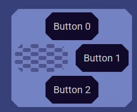
Over here there are only 3 buttons so the 4th slot is filled in with a disabled area.
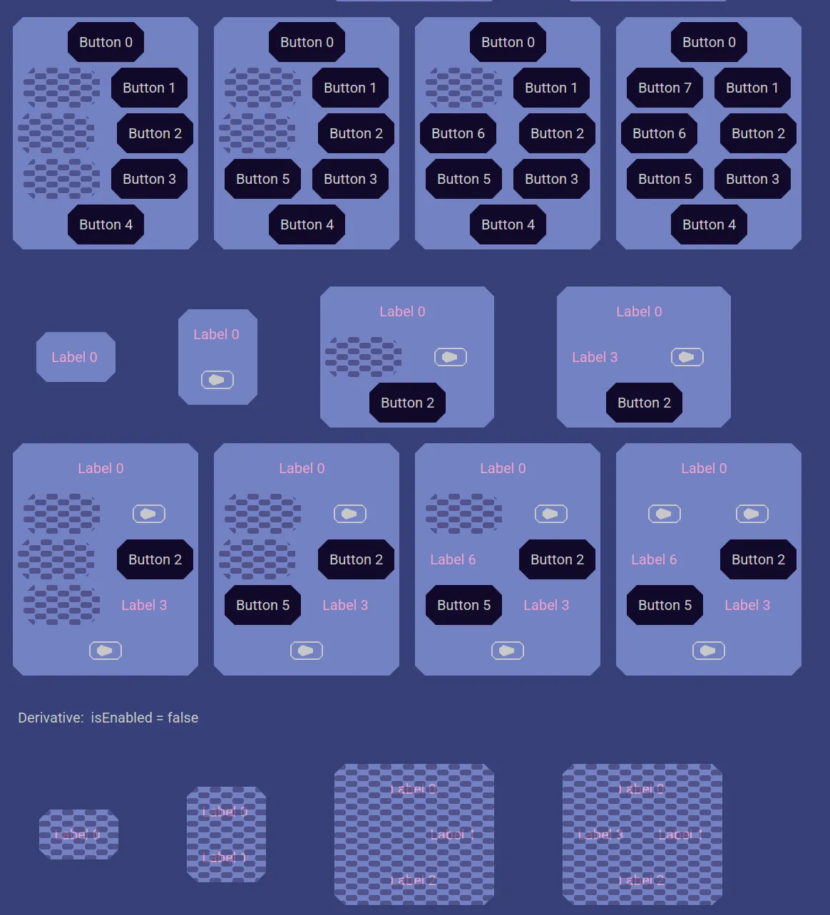
Here are more examples, and what a disabled one looks like.
Window Background Animations
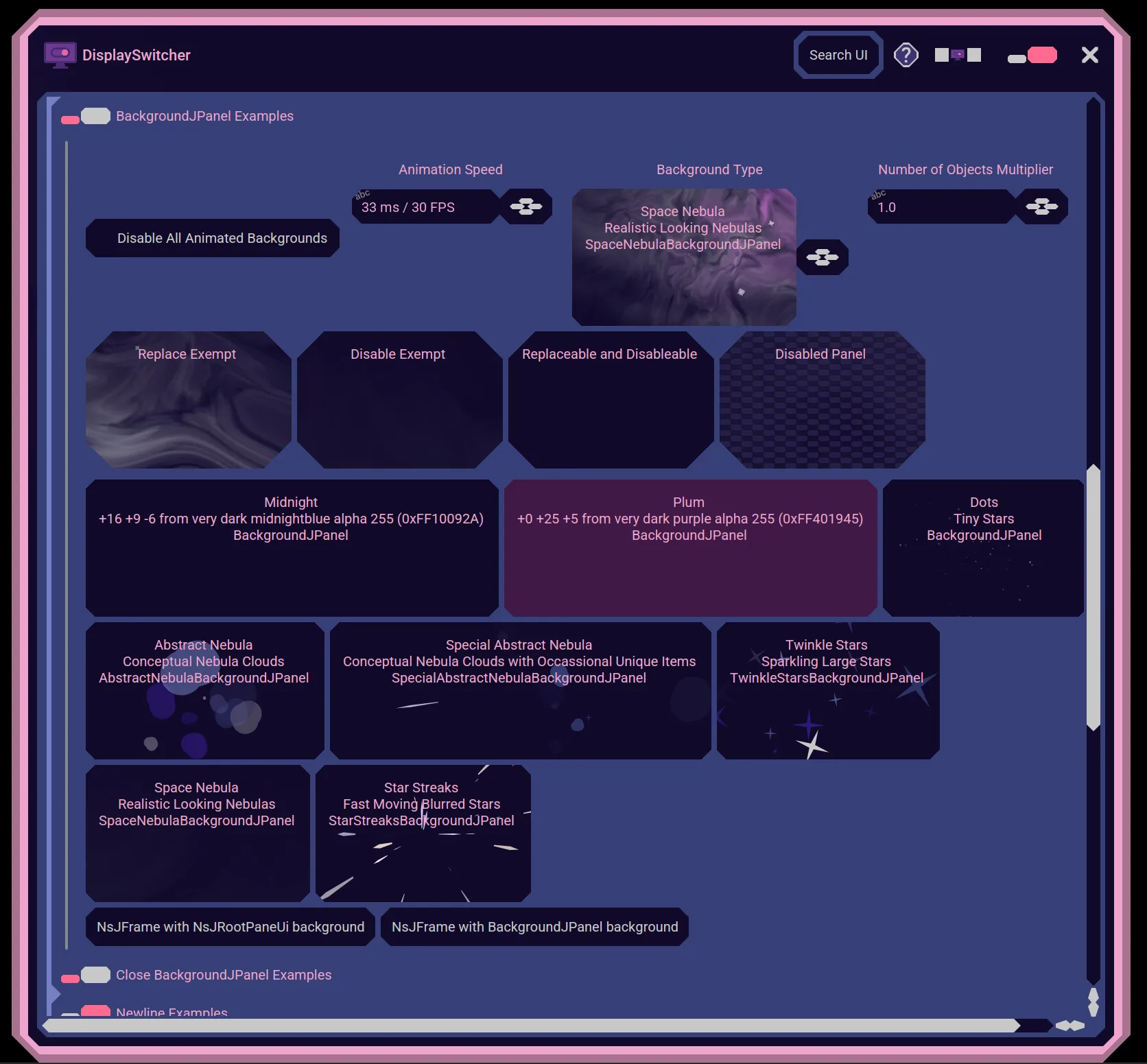
Nebula Software windows can display background animations. You may be able to select the animation you prefer or disable animations. The user interface may sit on top an block or see through to the animation. Here are some examples.
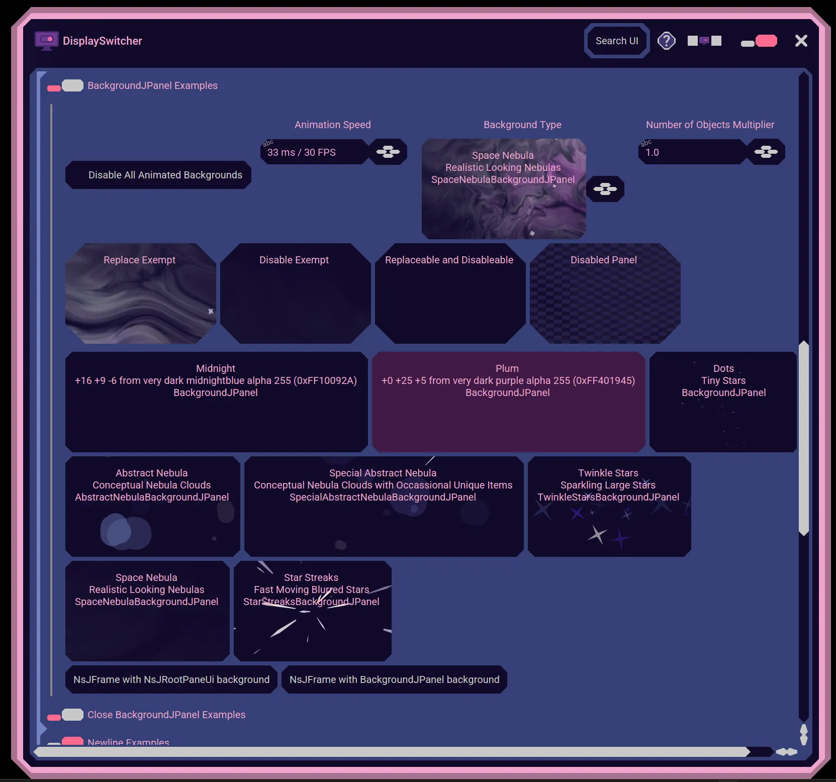
The background animation only runs when the Nebula Software window is active.
Lists
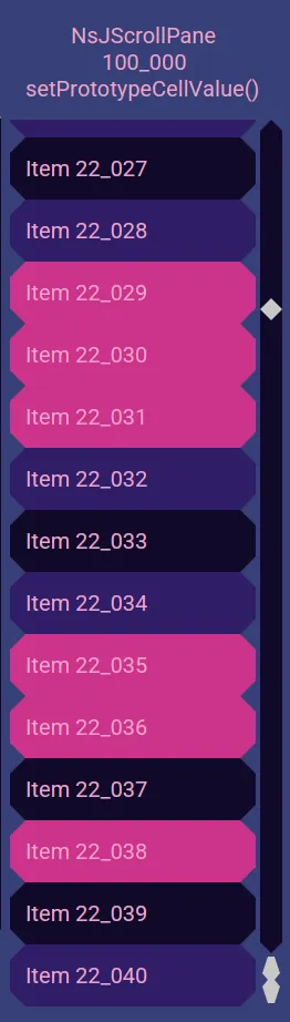
Nebula Software list components display rows of items. The rows alternate colors for readability.
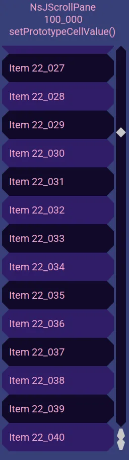
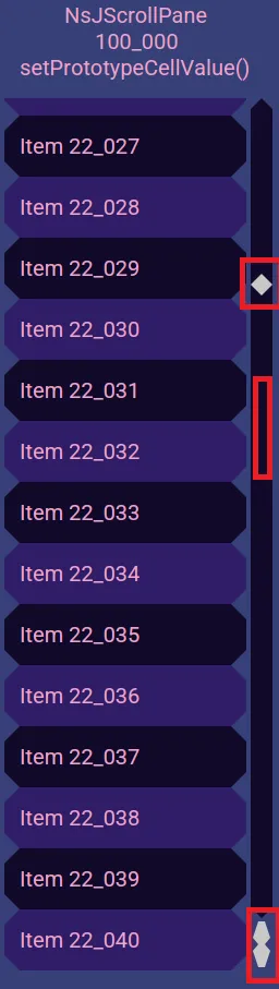
You may scroll by clicking the up and down arrows, dragging the knob, clicking in the track, holding the button down in the track, or using the mouse wheel.
For lists that allow selection, click to select and click again to deselect.
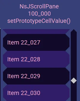
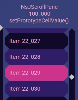
You may drag to select several rows at a time. You may have multiple sequence selections. Hold down the shift key while dragging to deselect.
Split Panes
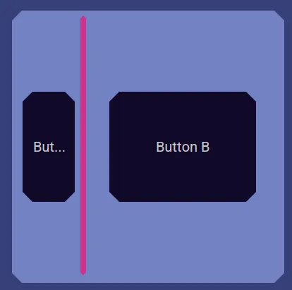
Nebula Software Split Panes allow you to choose how much available space to give to one side or the other. When user interface space is limited, this lets you be in control of which part gets more room. You do so by dragging a divider bar. The bar may split the UI horizontally or vertically.
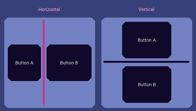
Drag the bar to adjust the available space and the UI will grow and shrink accordingly.
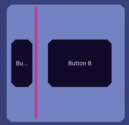
If an area gets too small to show the UI, the UI disappears and is replaced by a label that tells you the area is too small and to see its UI you would have to slide the bar to give that side more room.
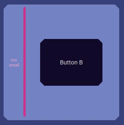
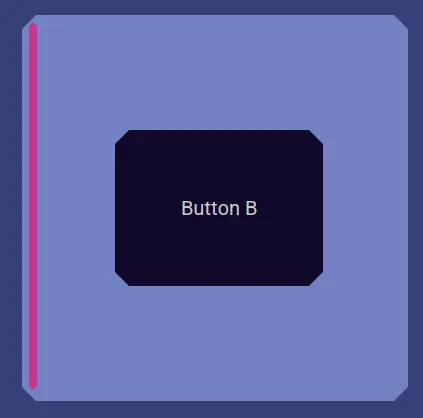
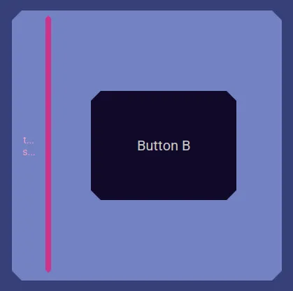
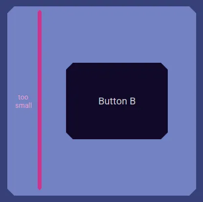
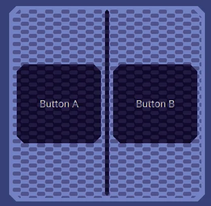
Here is an example of a Split Pane that has been disabled.
Sliders
Sliders allow you to select a value from a range by dragging a knob, clicking in the track, holding the mouse button down on the track, clicking arrow buttons, or scrolling with a mouse wheel.

They may be horizontal or vertical.
A Slider may have tick marks, labels, tick marks with labels, or even graphical items.
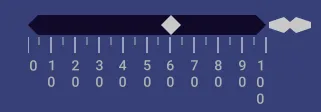
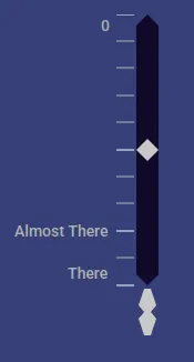
Sometimes it is important for you to choose a value that is exact. To aid you, when adjusting the value, if the value is over a tick mark or label, it hilights.
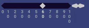
Another way to aid you to set an exact value is when some Sliders snap the knob to the closest tick or label divider.


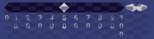
Sometimes user interface components are not allowed to be used and are set to be disabled. Here is an example of a disabled Slider.
Collapsing Panels
Nebula Software has collapsing panels. Single click on its icon or label to expand or collapse it.

When expanded, there is a companion close icon and label. You can click on it to collapse the panel.
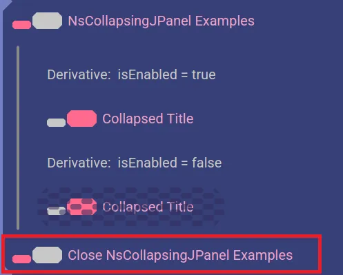
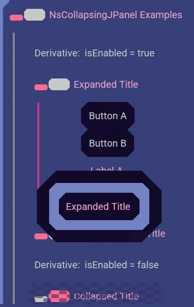
When expanded, there is a bar drawn between the top and bottom icons to show all the content in its expanded area.
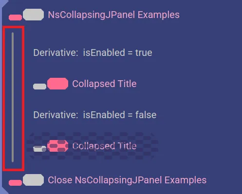
You may hover over it to see which panel will collapse if you click that bar.
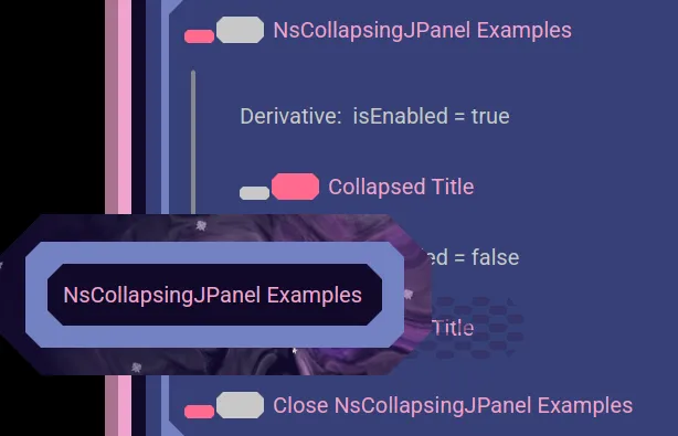
That is useful to identify which panel to close with which bar, like when you have a collapsable panel that contains a collapsable panel, or if the content is scrolled out of view.
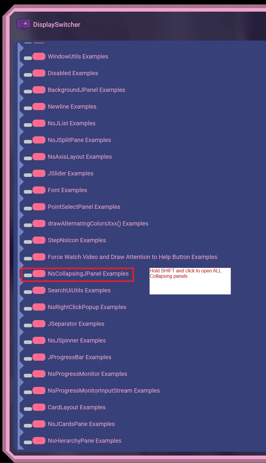
If there are multiple collapsable panels in a user interface, you may hold the shift key down when clicking on one of them to open or close all of them at once.
Sometimes user interfaces items are blocked from allowing you to use them. Here is an example of a disabled collapsed panel.

Right Click Popups
Some Nebula Software applications may provide a mouse right click popup to allow you to select a value.
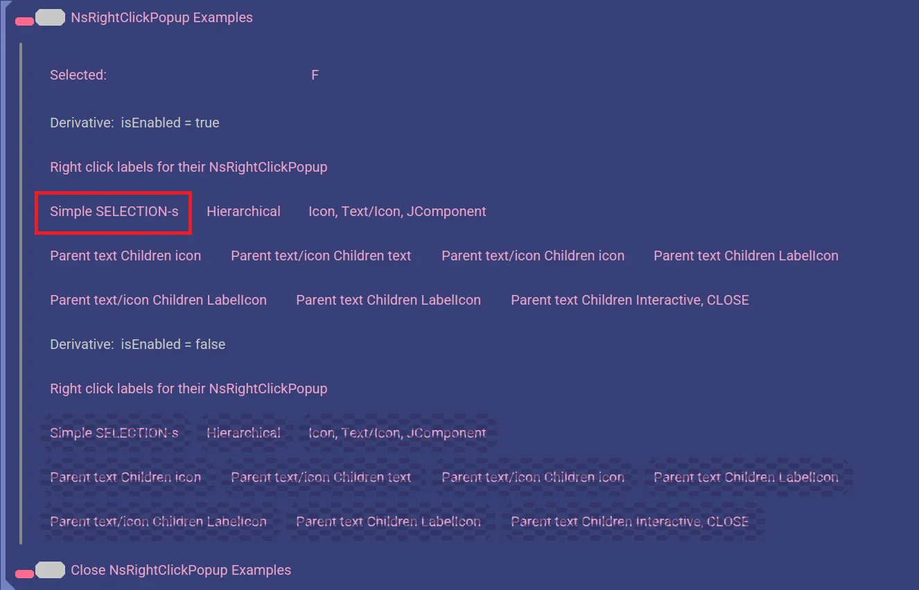
If you want to cancel choosing an item, then move off the item choices and select the background.
The popup might open a second popup to represent hierarchically organized choices.
Separators
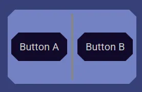
Some user interface sections may be separated from other sections with a muted separator line.
Spinners
Spinners are user interface components that allow you to choose from a range of values using up and down arrows to "spin" through the choices.
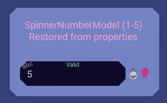
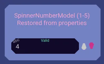
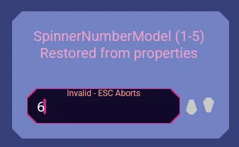
Some Spinners allow you to type in a value and will indicate if the value is valid or not.
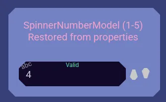
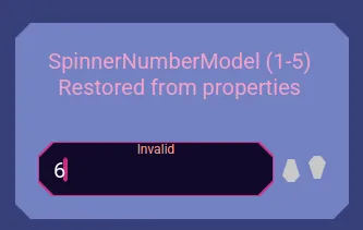
When a value is invalid the text entry tries to keep you editing, but you can jump out of it with the escape key.
Progress Bars
Some Nebula Software applications will show progress using progress bars. They show the percentage and gradually fill the bar background to visually represent the progress.
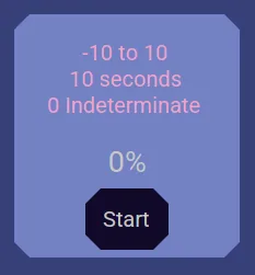
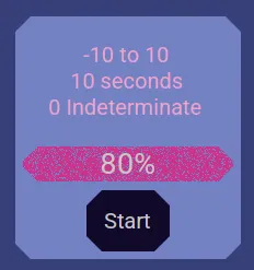
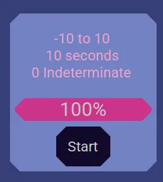
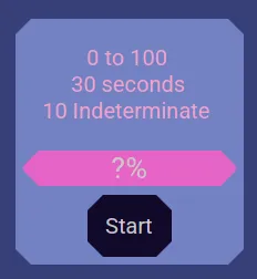
Sometimes the progress cannot be calculated and so an indeterminate progress indicator is shown.
Progress Monitors
During lengthy operations, Nebula Software applications may display a Progress Monitor. They show progress until the operation is completed.
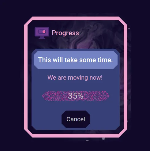
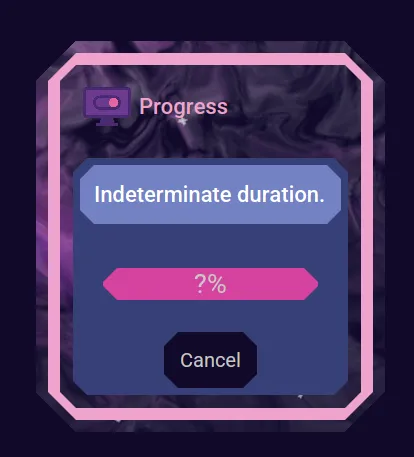
If the duration cannot be calculated, then an indeterminate Progress Monitor will be shown.
Card Layouts
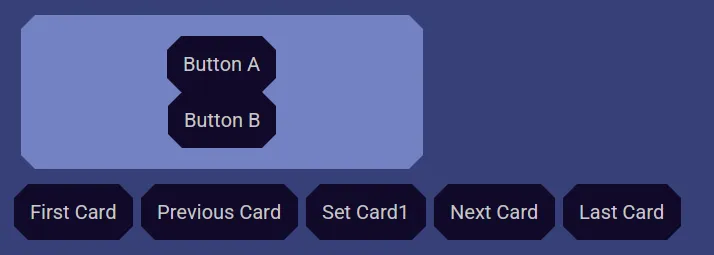
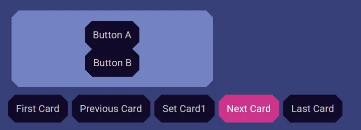
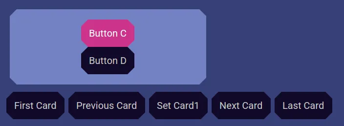
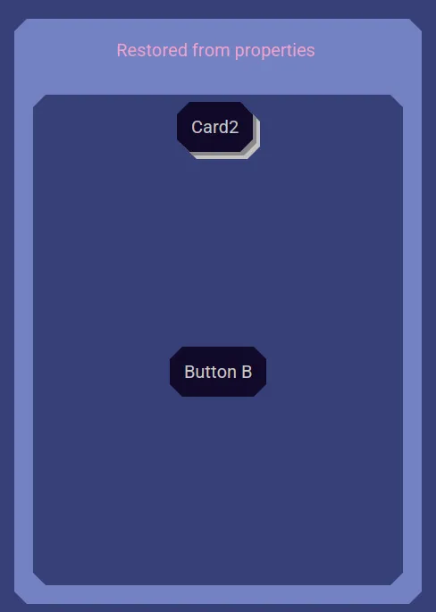
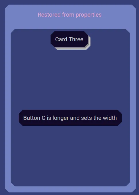
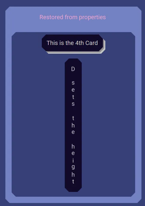
Some Nebula Software applications may use a Card Layout user interface. Think of it as a stack of playing cards and you get to view just the card that has been moved to the top. In this example, there are 3 cards. Card 1 has Buttons A and B. Card 2 has Buttons C and D. Card 3 has Buttons E and F. You choose which user interface card is shown. This allows a smaller user interface area to be used for many user interface components by choosing which ones get to be displayed.
Card Panes
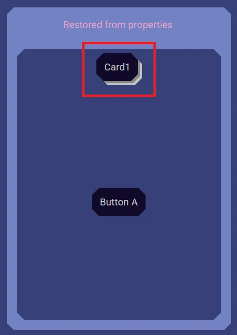
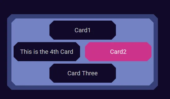
Some Nebula Software applications may use a Card Panes user interface. Think of it as a stack of playing cards and you get to view just the card that has been moved to the top. You choose which user interface card is shown. This allows a smaller user interface area to be used for many user interface components by choosing which ones get to be displayed. Click the card stack to be presented with a popup that allows you to choose the card you want on top.
Hierarchy Panes
Some Nebula Software applications may use a Hierarchy Pane. This is a list of items where an item might be a container of other items. Like a folder listing and open a sub folder to see its folders and files.
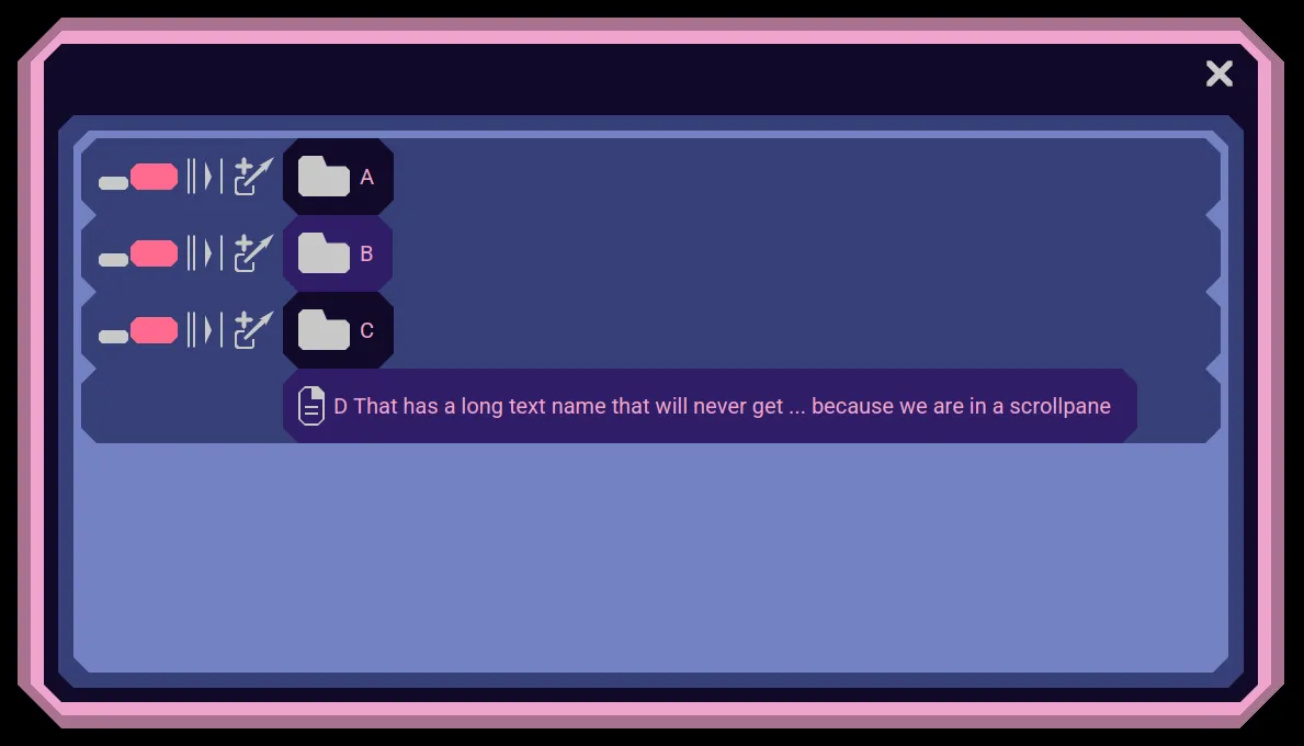
You open a container with a single click on its icon. You may also double click the container's name to open it.
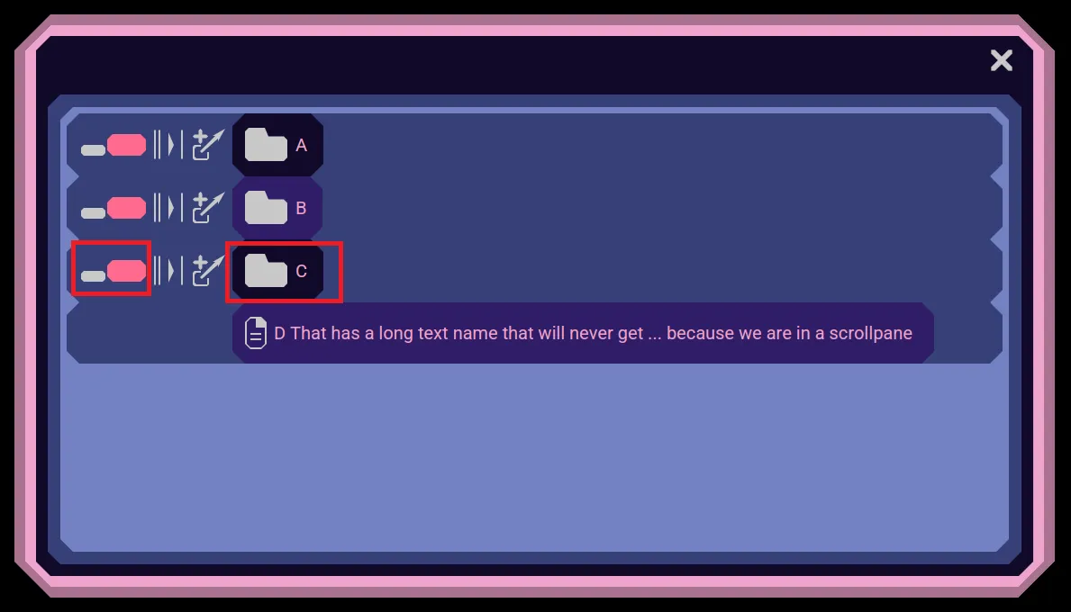
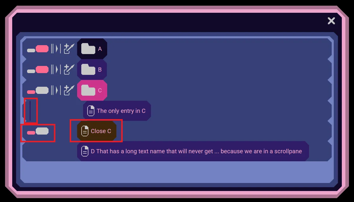
You may close the container with a single click on its companion close entry's icon, or double clicking the close entry.
You may also close a container by clicking its bar.
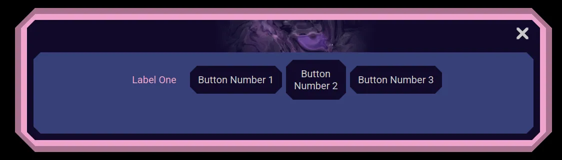
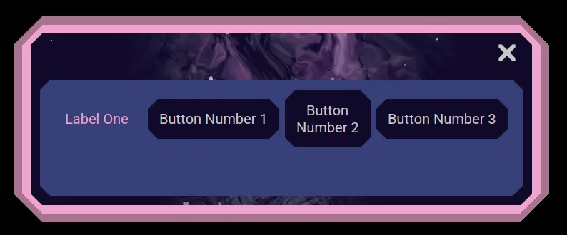
Flow Layouts
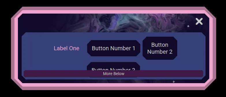
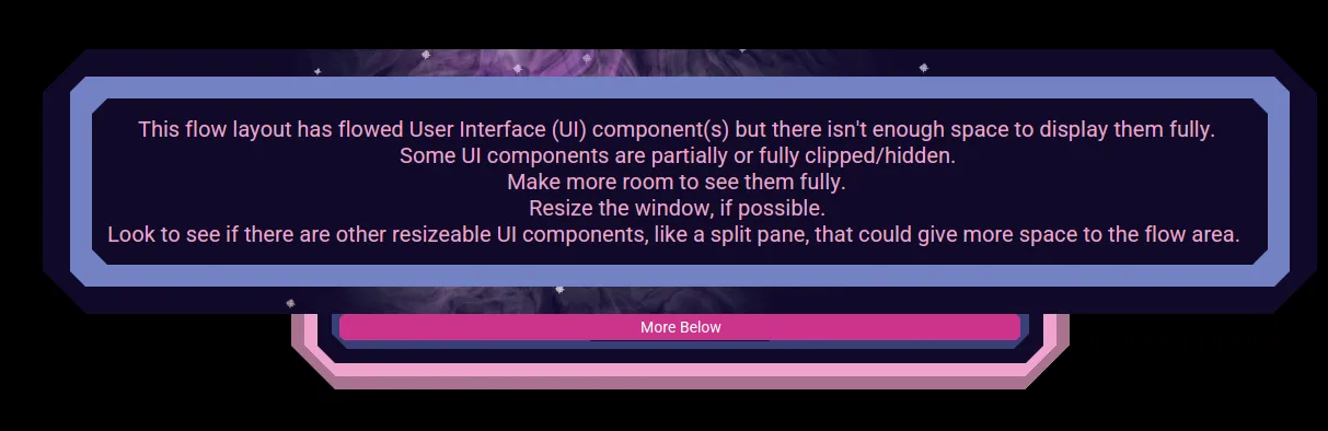
Some Nebula Software applications may use a Flow Layout. This allow user interface components to be laid out in a horizontal row or vertical column and when the UI components can no longer fit, they wrap. When wrapping has occurred, a visual indicator lets you know that you might not be seeing all the UI and to see it you would need to resize the area it uses to be able to see all the UI.